Colour Theory for Creatives
Part 2: Meet the Colour Wheel — Your New Creative Sidekick
In our last post, we asked: what is colour theory, and why should you care?
Now let’s get hands-on with one of the most useful tools in your creative kit: the colour wheel.
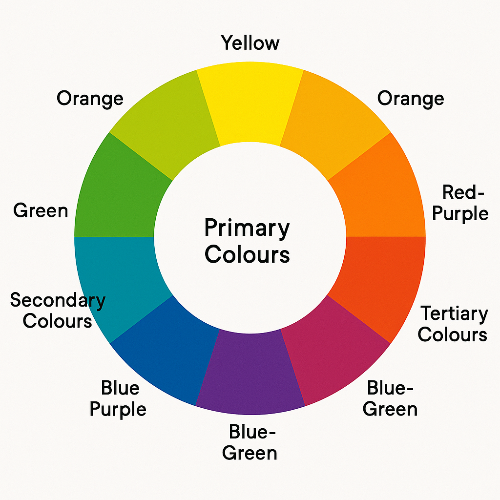
What Is the Colour Wheel?
The colour wheel is like a designer’s compass. It maps out colours in a circle, showing how they relate to each other. It’s the foundation of colour theory and, once you understand it, choosing colours becomes so much easier.
Here’s the basic structure:
- Primary Colours: Red, Blue, Yellow (you can’t mix these from other colours, They’re the source of all other colours)
- Secondary Colours: Orange, Green, Purple (a mix of primary colours)
- Tertiary Colours: Red-orange, Yellow-green, Blue-violet, etc. (a mix of a primary and a neighbouring secondary colours).
Why a Wheel?
Colour isn’t just a list. It’s a spectrum.
By arranging colours in a circle, the wheel helps us see which colours are close, which colours are opposite, and which colours create harmony or contrast. It’s not just theory. It’s a practical tool you’ll use constantly.
Warm vs Cool Colours
Another thing the wheel helps with is colour temperature.
- Warm Colours (Red, Orange, Yellow): Energising, bold, often associated with sunlight and heat.
- Cool Colours (Blue, Green, Purple): Calming, peaceful, and often linked to water or sky.
This matters when setting a mood in your design or illustration. Want to create a cozy vibe? Try warm tones. Need something serene or techy? Go for cool tones.
Lightness, Brightness, and Intensity
When we talk about colour, we’re not just talking about hue (like “blue” or “green”). There are three qualities to every colour:
- Hue is the actual colour (e.g., red)
- Saturation refers to how vivid or muted it is
- Value denotes How light or dark it appears
This is where things get fun: changing just one of these can completely shift how a colour feels.
Try This at Home
Pick a photo or artwork you love.
Can you identify the primaries, secondaries, or any complementary pairs of colour?
Is the palette warm, cool, or a mix?
Are the colours bright or soft?
You’re training your eye every time you look.
Coming Up Next: Making Colours Work Together
In the next post, we’ll learn about colour harmonies. Simple combinations that take the guesswork out of choosing colours. Think of it as the “chords” [musical] of visual design.
Until then...
There are many great colour wheels, available on Amazon. I use this one: by
Leave a Comment
I hope you enjoyed this post. If you would like to, please leave a comment below.