
Colour Theory for Creatives
Part 3: Colour Harmonies That Make Design Sing
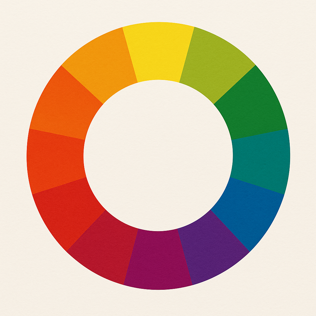
Your colour wheel is your instrument, colour harmonies are the chords.
They’re the tried-and-true combinations that designers and illustrators use to make colour choices feel intentional, balanced, and powerful. And the best part? You don’t need to guess. The colour wheel already has the answers.
What Are Colour Harmonies?
Colour harmonies are specific groupings of colours that look good together. They’re based on the geometry of the colour wheel. Think opposites, neighbours, or evenly spaced colours.
Let’s explore the most useful ones.
1. Monochromatic
One hue, many values and saturations.
This harmony sticks to a single colour and explores its variations.
Good for: Minimal, modern, clean designs
Example: Light blue, sky blue, navy
Action to consider: Use contrast in value (light vs dark) to avoid a flat look.
2. Analogous
Colours that sit next to each other on the wheel.
Think red-orange-yellow or blue-blue-green-green.
Good for: Natural, soothing visuals
Example: Forest green, olive, chartreuse
Action to consider: Choose one as your dominant colour and let the others support it.
3. Complementary
Use olours directly opposite each other.
High contrast, high drama.
Good for: Bold statements, logos, calls-to-action
Example: Blue and orange, red and green, yellow and purple
Action to consider: Let one dominate and use the other as an accent to avoid a visual fight.
4. Split-Complementary
One colour and the two neighbours of its complement.
It offers contrast without the intensity of straight complements.
Good for: Friendly, balanced palettes
Example: Blue with red-orange and yellow-orange
Action to consider: Great for illustrations where you want contrast but not too much tension.
5. Triadic
Three colours evenly spaced around the wheel.
Think triangle.
Good for: Playful, vibrant compositions
Example: Red, yellow, blue or green, purple, orange
Action to consider: Adjust the saturation to keep things harmonious — three bright colours can overwhelm.
6. Tetradic (Double Complementary)
Two complementary pairs.
This gives you a rich palette but, it can get chaotic fast.
Good for: Complex compositions or character-rich illustrations
Example: Blue & orange, green & red
Action to consider: Stick to one dominant pair and tone the others down.
Want to See These in Action?
Try pulling sample harmonies from film stills, paintings, or even your wardrobe. You’ll start to see harmony and, once you do, you can recreate it on your own terms.
Coming Up Next: The Psychology of Colour
In the next post, we’ll go deeper into what colours mean and how they can affect your audience emotionally, culturally, and even subconsciously.
Leave a Comment
I hope you enjoyed this post. If you would like to, please leave a comment below.