Colour Theory for Creatives
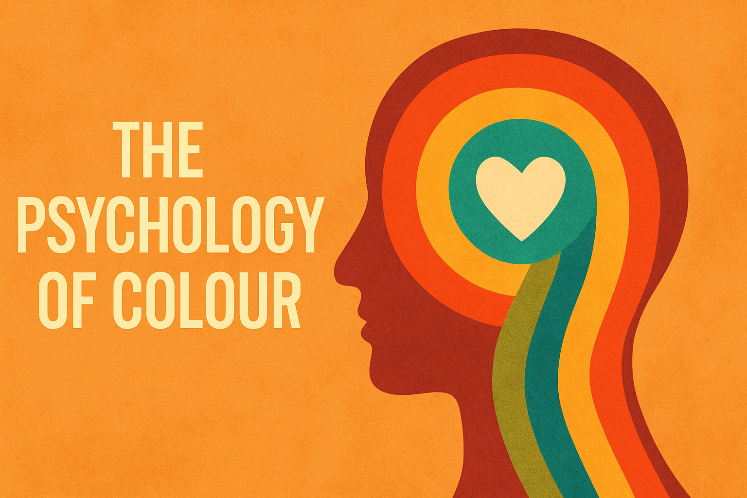
Part 4: The Psychology of Colour
Colour doesn’t just catch the eye. It connects with the heart. That’s the magic of colour psychology: the idea that certain hues can trigger emotions, memories, and even behaviours.
In this post, we’ll explore how colour speaks to your audience on a deeper level and how to use that to your advantage as a designer or illustrator.
Colour Is Emotional
Ever felt calmer in a room painted blue? Or more alert after seeing a bright red ad? That’s colour psychology at work.
Different colours tend to evoke different emotional responses. Here’s a quick guide to some of the most common associations:
Red – Passion, energy, danger, excitement
Orange – Warmth, creativity, friendliness
Yellow – Optimism, happiness, caution
Green – Nature, balance, health, money
Blue – Trust, calm, professionalism, sadness
Purple – Luxury, mystery, imagination
Black – Power, elegance, authority, mourning (in the West)
White – Purity, simplicity, cleanliness (also mourning in some cultures)
But It’s Also Cultural
Here’s where things get a bit more interesting: not every culture sees colour the same way.
- Red can mean luck in China, but danger or stop in the West.
- White often symbolizes purity in Western weddings but, is used for mourning in parts of Asia.
- Green can be the colour of nature or political movements, or religion.
As a designer or illustrator working across audiences, it’s important to think beyond your own context.
Case Study: Brands and Colour
Think about these brands:
- Coca-Cola: Red = energy, boldness, confidence
- Facebook: Blue = trust, communication
- Starbucks: Green = growth, calm, sustainability
These companies use colour deliberately to reinforce their identity and they do it consistently.
How to Apply This in Your Work
- Start with the feeling you want to evoke.
- Use colour intentionally to reinforce that message.
- Consider context: who is your audience, and what will they associate with each colour?
- Test and observe. Sometimes, you’ll find emotional associations that surprise you.
"Color Psychology is a complex subject that can overwhelm anyone, especially when what we want is information that is accessible and easy to consult so we can apply it to our projects." Color Psychology Made Simple: A Reference Guide to the Meanings and Uses of Colors for Branding, Marketing, Graphic Design & Art Projects Paperback by EM SANS (As an Amazon associate, I earn from qualifying purchases).
Coming Up Next: Building Colour Palettes That Work
Now that you know how colour feels and behaves, we’ll walk through how to create custom palettes, using tools, tricks, and real-world inspiration.
Leave a Comment
I hope you enjoyed this post. If you would like to, please leave a comment below.